For the Rundown Block:
- remove the border (maybe give me css code for this so i can do it on some websites but not on all)
- the bullet points should be a little closer to each other
- Links should be styled like the rest of the theme
Make a copy of the rundown block, name it grey box, where i can just put some text with an editor Basically the same just without bullet points. Basically so i can use it to highlight stuff.
ONLY For Mobile on the phone:
make the feautred image fullwidth and remove white at the top and sides
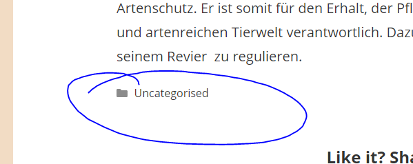
Remove the category thing at the end of the posts.
